Alexa
Mobile App
Refocusing the Alexa Mobile App around its top customer segment—Smart Home—with a new component system, simplified navigation and a from-scratch design system called Mosaic.
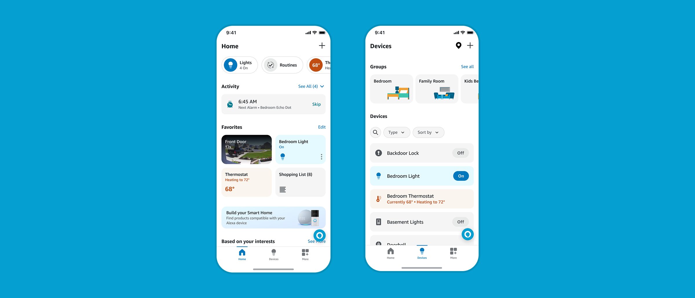
overview
In 2023 the Alexa Mobile App team refocused the app around Smart Home, which was where its top customer segment already lived. The directive we were given was to de-clutter and simplify, and I led design and delivery of several new components against it, each one supporting light and dark OS themes and meeting accessibility requirements on a tight timeline.
Two of the working principles were mine to solve for: build hierarchy through typography and spacing instead of adding shapes, and make device state legible enough that a customer trusts what the app is telling them.
navigation and typography
Simplifying meant taking the shapes out and letting type do the work, so I redesigned every navigation component in the app: Page Headers, Bottom Sheet Headers and the Bottom Bar, plus the Section Headers that run through the whole thing. Those had been small, tracked-out all caps, which reads as a label rather than a heading and disappears when a screen gets busy. I moved them to a bolder title case and added padding above the text so each section had room to breathe and you could scan the page by its headings alone.
mosaic design system
To keep one visual language across that many components, I helped build Mosaic with the Creative Director and another visual designer. The decision that mattered most was naming: components ask for a semantic token like mode-light.button.app-default.background.primary.default rather than a base value like blue-600. It is more to type, but it means a theme change or a contrast fix is a token change in one place instead of a sweep through every screen that happened to use that blue. The type ramp is built on Ember, Alexa's proprietary typeface, so the app stays inside the Alexa and Amazon brands by default.
FIG_01 — Mosaic base color tokens and type ramp
components
Favorites Tiles came first, designed with the lead interaction designer and our product manager: quick access on the home page to individual devices, device groups, shopping lists and recently played media. A tile has to show state and accept a control in the same small box, which is what most of that design time went to. The Home Shortcuts Bar sits at the very top of Home as a customizable carousel of aggregated device category controls, non-device shortcuts and device upsells. Because it takes the most prominent position in the app, it went through several rounds of UX research and product and leadership review before it settled.
I partnered with the lead motion designer on state and motion across both, animating icons on state change so a control confirms itself rather than waiting for the customer to check. The last piece was a Discovery Card Carousel and Monetization Banner, built as a scalable system inside Mosaic so product and domain partners could use it without new design work, along with empty states for device types a customer does not own yet, so a Smart Plug or Camera section teaches something instead of sitting blank.
FIG_02 — Favorites Tiles and Home Shortcuts Bar components
media player
I also helped redesign and modernize the Media Player. The hard part was range: it has to hold every content provider and every screen size the app runs on, so I simplified how the controls group rather than adding variants. A companion Transport Bar, a mini persistent version of the player, floats above the core UI and stays visually consistent with the full player, so the two never read as separate features.
outcome
Despite an aggressive delivery timeline, the redesign improved the app's existing visual language while preserving its brand elements, creating a more wholistic feel across every touchpoint of the app.